Responsive Design: Daisy Plates Website: Responsive Site

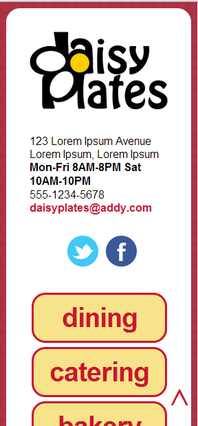
Daisy Plates responsive site screen capture

The final phase in the responsive site for “Daisy Plates”, an imaginary boutique catering business I designed in past articles is to apply media queries to make the site adaptive and then further tweak these media queries along with adding a meta tag to create the responsive site.

Daisy Plates Responsive Website

It had been a while since I visited the responsive design world, so it was time to brush up – and learn some new things as well – with some teamtreehouse.com tutorials.

First, I had to determine what my target devices would be. In an earlier article, although I was in practice building for desktop, iPad and iPhone, I said I would test in the devices available to me: an Android tablet, an Android phone, Windows 7 desktop in the latest IE, Firefox, Chrome and Sarafi browsers, as well as Safari on a Mac if I could access one.

Continue reading

Responsive Design: Daisy Plates Website: Fluid Site

The next phase in the responsive site for “Daisy Plates”, an imaginary boutique catering business I designed in past articles is creating a fluid site, at the core of which is a fluid grid.

You may recall my link to teamtreehouse.com about the four phases of websites leading to responsive design. Phase two is the fluid site which is built on relative widths of elements. More specifically here, we will be making the grid that organizes the divs on the site fluid, by converting specific pixel widths, as well as margins, to percentages. We will also be converting fonts from pixels to ems, which you can think of as a percentage of the default font size that the browser is using. We will follow this formula for converting fixed items to fluid: target / context = result. Finally, we will set up automatic scaling of some images in the site.

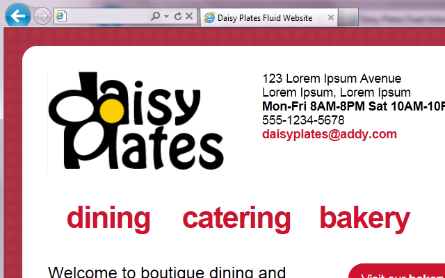
Daisy Plates fluid site screen capture

Daisy Plates Fluid Website

Continue reading

Responsive Design: Daisy Plates Website: Fixed Site

Alrighty, after some time spent in the PHP world I have journeyed back to responsive design. In particular, we have set out on phase one of the responsive site for “Daisy Plates”, an imaginary boutique catering business I designed in past articles. Phase one is the fixed site.

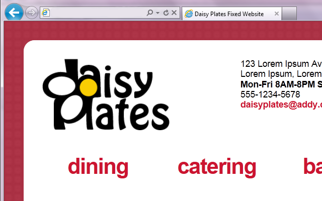
Daisy Plates fixed site screen capture

Daisy Plates Fixed Website

Continue reading

Responsive Design: Daisy Plates Website Design: Mockups

So far in my posts on the web design process for the responsive site for “Daisy Plates”, an imaginary boutique catering business, we’ve explored how I did research, chose a name, created a logo and selected a color scheme. We have arrived at the final steps in my design process – creating the mockups of the design! Please view part three for more background on how we got to this point.

Step 5: build a mockup for desktop browsers considering tabbing AND Step 6: build mockups for iPad landscape and portrait

I am writing about these two steps together because in the end, they became one. You will see.

First I focused on desktop.

Continue reading

Responsive Design: Daisy Plates Website Design: Logo and Color Scheme

Post three in my series on the web design process for the responsive site for “Daisy Plates”, an imaginary boutique catering business, details creation of a logo and selection of a color scheme. Please view part two for a reminder of how we got to this point.

Step 3: create a logo

Once I had decided on “Daisy Plates” as a name for the business, I set to thinking about the logo. At the same time (and honestly before I decided on the name as well) I really started thinking about the remaining steps of my design process, because they are so intertwined. I decided first that I would limit the site to four main sections based on the services Daisy’s company would offer: Dining, Catering, Bakery and Gifts. I would also need areas for contacting the company, general background info about the company and a news reel.

Continue reading

Responsive Design: Daisy Plates Website Design: Research and Name

Welcome to the second post in my series on the web design process for the responsive site for “Daisy Plates”, an imaginary boutique catering business! Please check out part one before we get started if you like.

Steps 1 and 2 of the process were as follows, and together they fit nicely into one post:

Step 1: research similar catering sites

I checked out at least five sites to do with catering, from small companies to larger-scaled businesses.

Continue reading

Responsive Design: Daisy Plates Website Design

Daisy Plates logo
When I decided that I would like to build a responsive site, I got a bit well…carried away in the site concept! I thought about what type of site might be enjoyable to design and build. I wanted it to be for a business, but nothing too complicated or large-scale, and a bit fun and quirky. I thought it could also involve food, since I’m known to build a creative salad plate here and there and take pictures of it (yes, bit dorky) and thought, hey, maybe I could use those pics! I decided on a boutique catering business.

I made a plan for creating the web design:

Continue reading

Responsive Design: Proving the Point

Responsive design is a hot topic these days, with many a debate surrounding it. What is responsive design? In it’s simplest form, picture this scenario. When you are at a restaurant with friends and you are all arguing over the name of the band who performed the obscure 80’s song playing overhead, it’s nice to be able to haul out your smartphone and open a site to find whatever you need to find to prove your point. If the site is easy to see and use, then it was probably designed to respond to the environment it is in, whether that is your smartphone or a 24-inch monitor. The site may possibly figure out the screen dimensions it is in and point you to a version of the site that fits your screen. Or perhaps it was built with automatically adjusting elements, like CSS “auto” widths for the page content. Or again perhaps it was designed to switch things up depending on your screen size – show a small logo here, remove non-essential text there, etc. More than likely, it’s a combination of all three! This is responsive design.

Continue reading