Hello fair coders, I hope you have been well! Recently I decided it was time to learn about frameworks, and in particular a very popular one called Bootstrap. Bootstrap is an HTML/CSS/Javascript front-end framework that is behind many sites including the one that brought it to life in the first place, Twitter. Using a framework like Bootstrap is like getting a snappy new Lego set — one with the basics, but also cool pieces like wheels and hinges, and a set of instructions to build a shiny new world, or in our case, website. However we all know when it comes to Lego, you often take a glimpse at those instructions and then do what you want anyway, and frameworks are cool with that too!
You can tweak and add to what the framework is doing until you have your beautiful creation. And if that isn’t your thing, you can still follow the instructions and have a nice polished website in a relatively short amount of time. Most folks probably find a route somewhere in between. A Lego cruise ship that also launches into space perhaps?
I’m going to try out a new format with this post as well, to keep things short and sweet. To get to the heart of the matter. To…well, if I keep up with the clichés my point may be lost! Let’s get to it.
The Goal
To learn about the Bootstrap 3 framework and put it into practice.
The Plan
First, I needed some training. I completed an excellent course on pluralsite called Bootstrap 3 by Shawn Wildermuth. With the support of this training and trusty sites like stackoverflow to fill in those little gaps, I would re-build my Daisy Plates Responsive Website in Bootstrap 3. I would not try to perfectly recreate the design of the current site, but would instead adapt to what Bootstrap offers, and customize where it seemed reasonable for style. And apparently I would make the site very pink, must be Daisy’s favorite color!
The Journey
Break it down…
- A clean starting point: I made a copy of my Daisy Plates responsive site, and went about cleaning it up to change my current grid system to a set of divs ready for Bootstrap. This included:
- sectioning off my site into header, footer and middle section main divs and updating the IDs within to better reflect the training
- removing my old classes and replacing with Bootstrap’s “col_md_XX” classes to start. col_md_XX for example indicates that this item takes XX columns at a medium screen width on the grid
- removing items I wouldn’t need for layout anymore like my “clear” divs and my “omega” classes and replacing with Bootstrap “row” classes where needed, and
- formatting my menu more similarly to the training
I updated a bit of styles that I currently had in place and generally just focused on getting a nice clean starting point for Bootstrap, with sections filling up the page as much as needed across the 12-column grid. There was no fancy formatting at this point.
- Getting Bootstrap: I obtained Bootstrap 3 and installed it, which consists of basically applying a set of CSS, Javascript and fonts files to your current files. I organized my files a bit to match the Bootstrap structure. After a few false starts (more on that below!) I was able to turn off my former stylesheets, normalize.css and my mainly custom index.css and flip on the Bootstrap default stylesheet. Just like that, my site came to (a somewhat humble) life!
- One feature at a time: From that point on, it was a series of small projects in my mind:
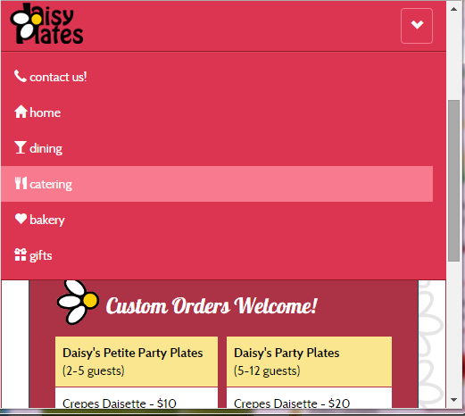
- get the menu to a good place using the Bootstrap navbar component which would use an arrow button to show the navigation buttons in a drop-down list on a smaller resolution
- building a working carousel using the Bootstrap carousel jQuery plugin inside a panel component
- sorting out the “The Daisy Special” button to give it style but still use the power of Bootstrap (hello button component and glyphicons!)
- having the newsreel at the bottom be in a Bootstrap well component, and
- don’t forget keeping the main content looking sharp!
- Stops along the way: I applied any extra styles I needed directly on the tags and then eventually moved them to index.css where my old custom CSS used to reside. I got into some modal windows with the Bootstrap modal jQuery plugin to show contact info at a smaller resolution and to expand a bit on “The Daisy Special” from the previous site with a window of game details. I left out items that didn’t seem to be needed anymore, like the navigational arrow for smaller screens, and turned on the Amelia Bootstrap theme I had downloaded (which was also used in the training) from time to time to see things from a different perspective.
- Making things pretty: After my main features were in place, I stepped back and looked at things. They were coming together, but needed to be prettier. There were still a few functional adjustments to make as well. I removed old divs, renamed files, renamed my IDs to a consistent format and gave other containers IDs — and did other general clean-up, and then of course updated the site to say it was copyright 2014! I got to the make-over part, and I went to town fixing up a number of things:
- adding the background image
- adjusting classes and margins
- playing with panels and font sizes
- adding icons…replacing icons
- …and many color changes using the Amelia theme as my base until I got it just right
It really wasn’t as arduous as it sounds, it was quite fun!
- Last stop: I fixed some final quirks. I adjusted the layout of the carousel navigation buttons by referencing this stackoverflow post, and adjusted “col_” classes including the “offset” classes to fix some horizontal scrolling and responsive scaling issues where for example, some items were running outside of their area when scaling down.
Early stage in the journey
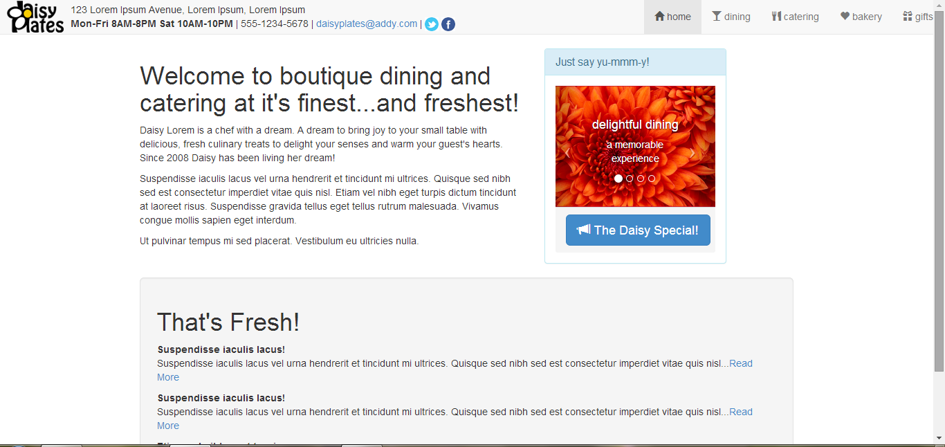
Getting there…
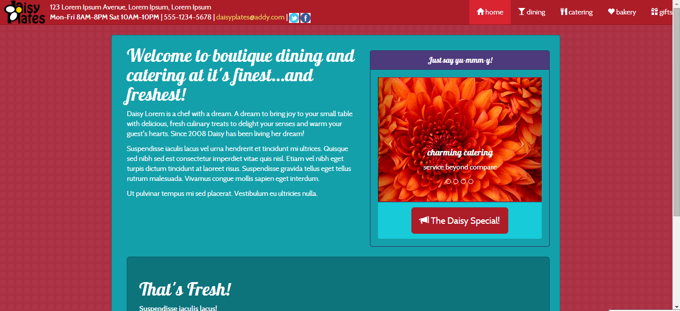
Almost there…
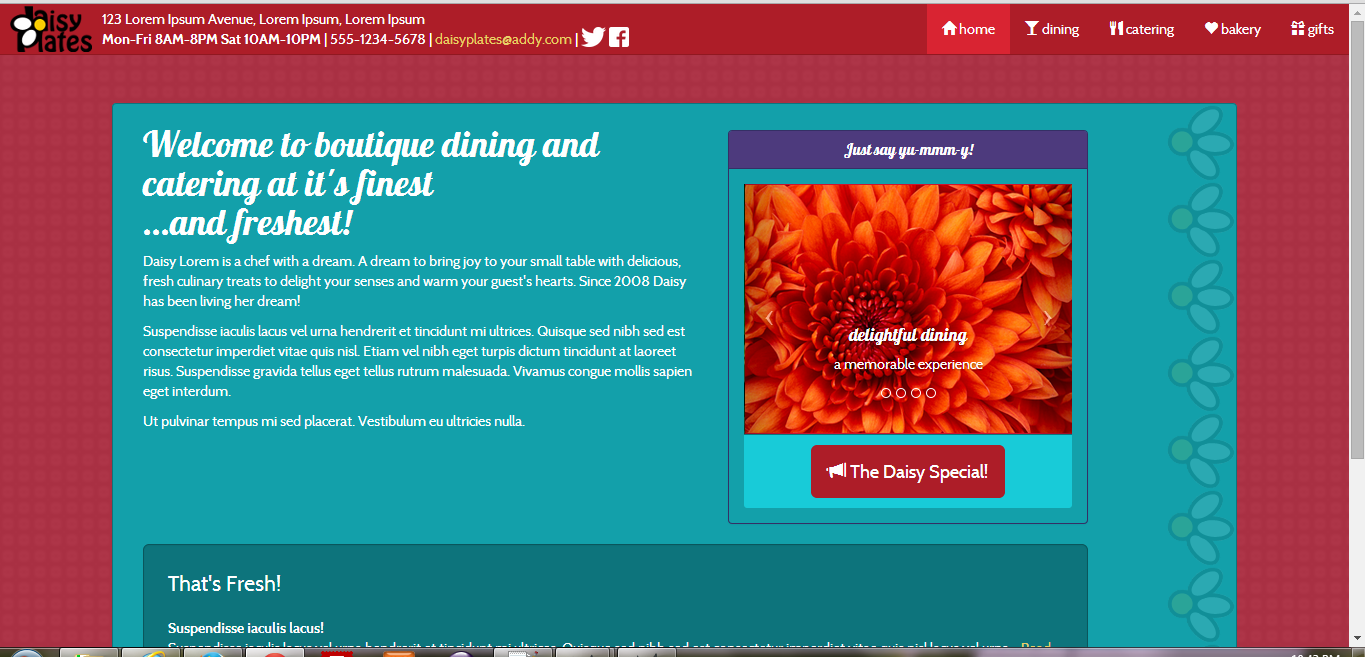
Arrived at our destination!
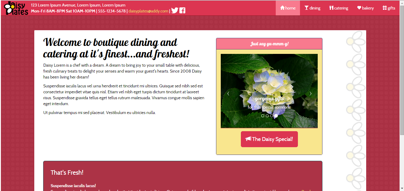
Here’s something cool!
This is the carousel plugin in action. See how sleek it is? Notice how I made this carousel sliiide to the left? I just put the slide class on it. Notice as well how simple it is to make a little arrow icon with the icon-prev class to take us to the previous slide.
<section id="services_gallery_area" class="visible-md visible-lg col-md-4">
	<div class="panel panel-info services_gallery">
		<div class="panel-heading">
			<h2 class="panel-title text-center">Just say yu-mmm-y!</h2>
		</div>
		<div class="panel-body">
			<div id="services_carousel" class="carousel slide">
				<ol class="carousel-indicators">
					<li data-target="#services_carousel" data-slide-to="0" class="active"></li>
					<li data-target="#services_carousel" data-slide-to="1"></li>
					<li data-target="#services_carousel" data-slide-to="2"></li>
					<li data-target="#services_carousel" data-slide-to="3"></li>
				</ol>
				<div class="carousel-inner">
					<div class="item active">
						<img src="img/win7_sample_img.png" alt="1" class="img-responsive" />
						<div class="carousel-caption">
							<h4>delightful dining</h4>
							<p>a memorable experience</p>
						</div>
					</div>
					<div class="item">
						<img src="img/win7_sample_img_2.png" alt="2" class="img-responsive" />
						<div class="carousel-caption">
							<h4>beautiful bakery</h4>
							<p>treats, treats, treats</p>
						</div>
					</div>
					<div class="item">
						<img src="img/win7_sample_img.png" alt="3" class="img-responsive" />
						<div class="carousel-caption">
							<h4>charming catering</h4>
							<p>service beyond compare</p>
						</div>
					</div>
					<div class="item">
						<img src="img/win7_sample_img_2.png" alt="4" class="img-responsive" />
						<div class="carousel-caption">
							<h4>gorgeous gifts</h4>
							<p>for that special someone</p>
						</div>
					</div>
				</div>
				<a href="#services_carousel" class="carousel-control left" data-slide="prev">
					<span class="icon-prev"></span>
				</a>
				<a href="#services_carousel" class="carousel-control right" data-slide="next">
					<span class="icon-next"></span>
				</a>
			</div>
			<div class="panel-footer text-center">
				<a href="#daisy_special_modal" data-toggle="modal" class="btn btn-primary btn-lg"><span class="glyphicon glyphicon-bullhorn"></span> The Daisy Special!</a>
			</div>
		</div>
	</div>
</section>
Besides some very tiny CSS tweaks for style, it takes just a teeny bit of jQuery as well to initiate it:
$(function() {

	$("#services_carousel").carousel();

});
Love it!
Challenges…and how I overcame them!
I ran into a few snags here and there. Some were as minor as the old faithful syntax error (boostrap.js anyone?) and once I thought I lost my index.html file altogether! I found that my Amelia fonts had to have direct http links to them in the CSS, as well as Chrome took quite a while locally to load the first time but loads fine when it is live, so I accepted that for now. I kept my JS files at the top of my site instead of the bottom as suggested by the training as again Chrome was having some issues at least locally with this.
I referenced the Web to help with some additional issues and used crafty workarounds for others. For example, the semi-transparent border of daisies to the right of the carousel which allowed for this area to be larger but not noticeable, so that the carousel could scale down and not appear outside of it.
I also made a decision that I was fine with things as is such as deciding not to look too far into lower browser support or trying to modify breakpoints, because that takes me beyond what I had learned from the training. By the end the site looked good and was very responsive on the three major browsers I tried (IE 11, Firefox and Chrome), so I was happy!
What was the most fun?
Once you get the hang of it, it can be so neat working with a framework like Bootstrap. As the training had suggested, you can start to anticipate what a class may be named to accomplish what you want, or if not they are easy to find. For example, I wanted to center some items, and text-center from the Bootstrap alignment classes did the trick. The grid structure is easy to work with too, using the Bootstrap classes like “col_md_XX”.
The carousel plugin was so simple to implement and I would look forward to trying more Bootstrap plugins based on that.
Tweaking of code and such considered, implementing responsiveness was quite painless. It adapts really nicely from the tiniest phone width to my widescreen laptop.
Finally I enjoyed using a theme and modifying it for what I wanted to see, that saves a lot of time!
The Result
Here is a link to the final site, note it has both the Home page and the Catering page where I gave the Bootstrap table a try.
I also include a link to the original responsive site. Please check out the source and compare!
Daisy Plates Bootstrap Website
Daisy Plates Responsive Website
My final thought on Bootstrap is that it is a great introduction to frameworks. It might have been a bit more challenging scaling back a responsive site and then applying Bootstrap as some styles were already in place that had to be re-evaluated, but, in other ways it was beneficial already having some of the layouts worked out in a grid system. It was a better workout on the brain overall and that is always a good thing! I would enjoy working with Bootstrap on a future project and checking out some other frameworks out there, maybe one that gets into more back-end coding. We’ll see where this coding journey takes me. Until next time!

