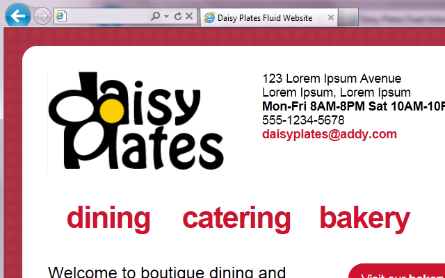
The next phase in the responsive site for “Daisy Plates”, an imaginary boutique catering business I designed in past articles is creating a fluid site, at the core of which is a fluid grid.
You may recall my link to teamtreehouse.com about the four phases of websites leading to responsive design. Phase two is the fluid site which is built on relative widths of elements. More specifically here, we will be making the grid that organizes the divs on the site fluid, by converting specific pixel widths, as well as margins, to percentages. We will also be converting fonts from pixels to ems, which you can think of as a percentage of the default font size that the browser is using. We will follow this formula for converting fixed items to fluid: target / context = result. Finally, we will set up automatic scaling of some images in the site.

The fluid grid gets the site stretching and contracting to suit more environments. This may work great for some items like long columns of text that take up most of the width of the site, but more often then not, at some point, our nice layout of the fixed site in the previous phase is going to start breaking a bit, and that’s where media queries will come in. That is the next phase though, and we won’t worry about that for the moment. The fluid version of the “Daisy Plates” website is the focus of this article.
Before we get into the code, let’s take a look at the fluid site and compare it to the fixed site. What has changed since?
Well, actually only the tiniest of things. I added another div called sup_container (as in “super”) to hold container so that I could achieve the centering of all content in my site once things started contracting. This new div seemed to move everything just the slightest to the upper left. After some attempts to correct it, I’ve decided to live with it as it is barely noticeable and doesn’t change anything overall in the design.
Additionally, I managed to fix the floating navigation arrow to take the user to the top of the site so that it is no longer using 12 sections of the grid, thus it no longer overlaps other links when it moves up and and down the site. It still floats into the red background beyond 1024 x 768, but when we get into media queries I’ve decided that we’ll hide this for desktop since we’ll have the vertical scrollbar available and that should suffice. We’ll also take a look at that point at any leftover overlap it may do in the smaller resolutions/devices. Honestly this was resolved quite organically, as in I’m not sure how it happened as I worked away at it, but we’ll take a look at the code later and see how it was done.
The same files are involved in this version of the site as the fixed version. All modifications were made to the two HTML pages and index.css.
Just to note, I validated the HTML pages with an HTML5 validator again and also checked tabbing was still working in a logical order. Although not sure how logical it is when things start to break, but we’ll tackle that in future phases!
As in my fixed site article, instead of going through the site code line by line, we are going to analyze common themes and specific sections and take a peek at the code as we go.
Converting pixel widths (and some margins) to percentages
Let’s take a look at a few examples of how I used the target / context = result formula when converting pixel widths to percentages in index.css to allow elements to scale dynamically when the browser window is resized and/or when viewing on different devices.
The new sup_container has a width of 982px which looks perfect at our maximum desktop browser resolution of 1024 x 768. Since it is our top-level element, target (982) / context (982) = 100%. Thus the width of this element now becomes 100%. However we don’t want it to stretch beyond what will look best in our maximum desktop browser resolution, so we put a max-width of 982px on this element as well.
.sup_container {
	width: 100%; /*982px / 982px*/
	max-width: 982px;
	margin: auto;
	padding: 0px;
}
Next, let’s look at container. This div sits inside of sup_container, so it can stretch with that div if we want, but not beyond it’s perfect width at our maximum desktop browser resolution. To ensure this, we switch the width attribute to max_width. Next we get into converting pixel margins to percentages. When you think about it, the current fixed 32px all around will be too much in small browser resolutions/devices, thus a percentage here would be best. When using our formula for margins, we must consider the outside container as the context. target (32) / context (982) = 3%. Note, sometimes I truncated percentages, sometimes I did not. It depended on what looked best at the time. I also had reduced the margin from 35 to 32 and removed the auto setting on the margin with the introduction of sup_container.
.container{
	max-width: 850px;
	margin: 3%; /*32px / 982px*/
	padding: 32px;
	border: 2px solid #ffffff;
	-moz-border-radius: 20px;
	border-radius: 20px;
	background-color: #ffffff;
}
Another large section where many pixels were converted to percentages was in the actual grid itself. These conversions were fairly easy to do, just target (width of grid class) / context (width of overall grid) = result
.grid_1 { width: 6.82%; } /*58px / 850px*/
.grid_2 { width: 15.94%; } /*130px / 850px*/
...
.grid_11 { width: 91.52%; } /*778px / 850px*/
.grid_12 { width: 100%; } /*850px / 850px*/
Throughout index.css I added more percentage conversions of widths and margins as needed, and sometimes just a switch to max-width from a width was required. At first I was switching a lot more than was needed, and had to scale back to what was really required. For example, you may always want an element of small width to be the exact width it is no matter the browser size, so you may leave it at a pixel size. Or, you may find you only want to make the left and right margins dynamic, but not the top and bottom, so left and right become percentages and top and bottom remain pixels.
You may also want to make padding dynamic, of which I didn’t seem to have to at this point. To do that, your context would be the actual element you are in instead of the outside container like with margins.
You may have to add in some more CSS here and there too when working out what will dynamically adjust the best, such as when I had to add float: left and width to #sg_left_nav and the other navigation elements for the gallery. I also had to remove the grid classes on those navigation elements in index.html because they were getting too custom to use the generic code.
Converting font sizes from pixels to ems
Let’s now take a look at an example of how I used the target / context = result formula when converting pixel font sizes to percentages in index.css to allow the font size of elements to scale dynamically when viewing on different devices.
This step was quite simple for this site. The fonts were all sitting on the main level of the site, that is, not nested inside of other elements with specific font sizes, so the context was always the standard browser font size of 16px. Thus the formula target (font size on element) / context (16px) = result was used to determine all the new font sizes in ems, such as the following. Note, I particularly use all values after the decimal point when converting to ems as this is what I saw in the training I completed, and it looks to give us a nice specific number.
h1
{
	font-size: 1.375em; /*22px / 16px*/
	font-weight: normal;
	margin: 0px;
}
Automatically scaling images
This step was quite simple as well. We just want to set up specific images so that they will scale dynamically when the browser is resized and/or when viewing on different devices. In this case we do not use our formula, but instead just assign a max-width of 100% on the images we would like to scale. This will also ensure the image does not stretch beyond its actual dimensions. This should work for IE 7+. For IE 6 and below there is alternate CSS, but that support is outside of my scope for this project.
As noted, I would only want this for specific images, like those in the gallery, and not on others, like the daisy button image which can stay the size it is always. I had to additionally add classes to some image elements and in the case of the main logo below, also add this class to the element in index.html:
#daisy_logo img
{
	max-width: 100%;
}
Lastly, that floating arrow…again
I designed this site with a floating navigation arrow to take the user to the top of the site, using a caret text character. In this version of the site I managed to fix its issue of using 12 sections of the grid and hence overlapping other links when it moves up and down on the site.
The secret lies in removing its grid class back in index.html, assigning it a maximum width of 50px and adding a dynamic position from the right of its container. So now it is just a small floating div at the bottom right of the screen.
Here is a peek at the arrow in index.css and index.html:
#up_nav
{
	max-width: 50px;
	position: fixed;
	bottom: 20px;
	right: 4.35%; /*37px / 850px*/
	text-align: right;
	font-size: 2.625em; /*42px / 16px*/
}
<div id="up_nav"> <a href="#">∧</a> </div>
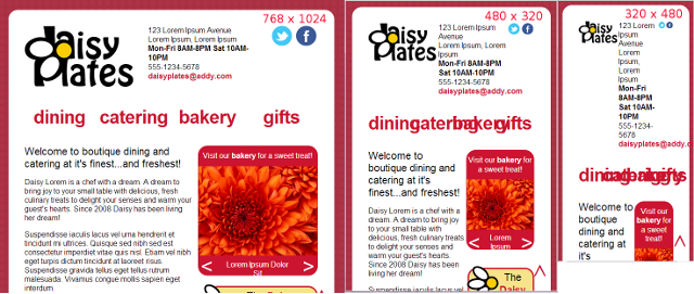
The following shows how the site is scaling in Chrome at 768 x 1024 (portrait tablet), 480 x 320 (landscape iPhone) and 320 x 480 (portrait iPhone). You will notice the layout starts to break down more with each, but they are dynamically scaling. That is okay, as our next phase will handle these breakpoints using media queries.

Take a look at the full source code for the site through your browser if you like, where you will see I have comments on all the code conversions in the CSS. The next phase in the responsive site journey is the adaptive site, which uses media queries but doesn’t have to be built on a fluid grid. The last phase is the responsive site. It uses media queries and a fluid grid. Well we already have our fluid grid, so I think our last phase will be more responsive rather than adaptive. On to the next and final phase of the “Daisy Plates” responsive website!
