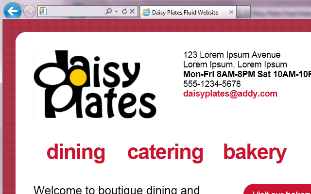
The next phase in the responsive site for “Daisy Plates”, an imaginary boutique catering business I designed in past articles is creating a fluid site, at the core of which is a fluid grid.
You may recall my link to teamtreehouse.com about the four phases of websites leading to responsive design. Phase two is the fluid site which is built on relative widths of elements. More specifically here, we will be making the grid that organizes the divs on the site fluid, by converting specific pixel widths, as well as margins, to percentages. We will also be converting fonts from pixels to ems, which you can think of as a percentage of the default font size that the browser is using. We will follow this formula for converting fixed items to fluid: target / context = result. Finally, we will set up automatic scaling of some images in the site.

