So far in my posts on the web design process for the responsive site for “Daisy Plates”, an imaginary boutique catering business, we’ve explored how I did research, chose a name, created a logo and selected a color scheme. We have arrived at the final steps in my design process – creating the mockups of the design! Please view part three for more background on how we got to this point.
Step 5: build a mockup for desktop browsers considering tabbing AND Step 6: build mockups for iPad landscape and portrait
I am writing about these two steps together because in the end, they became one. You will see.
First I focused on desktop.
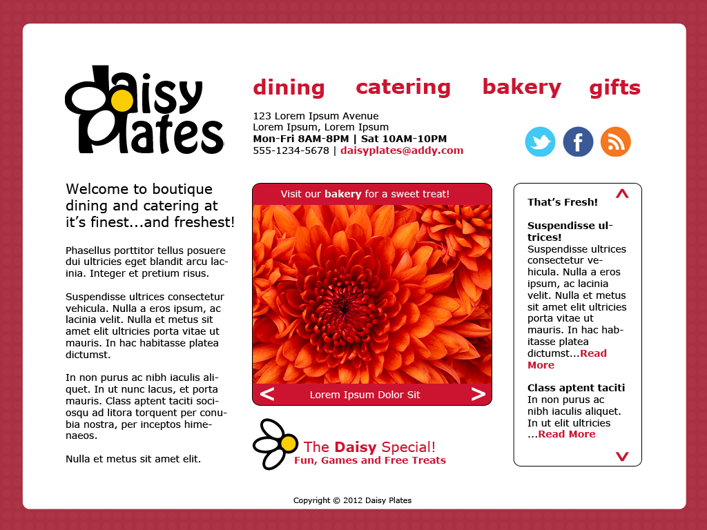
1024 x 768 resolution seemed like a reasonable starting point for a desktop version as it’s a pretty minimal specification that I have run into in my experience so far, although with some Web research I found that 960px wide is a common width to make your design when planning for this resolution. In any case, I designed for 1024 x 768 for my desktop mock-up, with the idea that this will indeed be a responsive site, so I will be ensuring that 960px for example will work anyhow.
The lines started to get blurry in designing for desktop vs. iPad (a tablet I had experience in, understandably not the only one out there). iPad landscape is also 1024 x 768. So I started to think of the first desktop design as covering both this and iPad landscape.
I also wanted to consider tabbing for desktop to add in a level of accessibility, i.e. how easy it could be for a user to navigate the site using the Tab key.
Recall how I originally wanted to use a plate concept? I decided in the end to make things a bit more simple for this first go at the responsive site. After various iterations where I kept and then discarded the plate and also napkin concepts, I decided on a few things.
First, I wanted the logo and contact info near the top of the screen, always. I also wanted the main sections to always be accessible, so they would have to be present at the top perhaps, and the content of the screen would change as they are clicked. Or alternatively they could be along the length of the screen, with the content changing to the left or right. I also wanted to squeeze the news reel in there somewhere, and to have bright photos of the product always visible, possibly in a gallery. There would need to be spot for secondary info that should be present as well, such as the copyright.
The layout started to take shape as a division into three main sections:
- logo, contact info, main links
- main content: text, images, news reel
- secondary content: extras – links to contests, copyright, etc.
I thought of organizing these three main sections in order down the screen, logo/contact etc. along the top, then main content in the next section across and secondary content at the bottom. Ideally, to keep the site responsive, these blocks of content could then move around in a logical way, stacking if you will, in smaller resolutions. This logical order would also be useful for tabbing in desktop.
My first design for desktop/iPad landscape more or less accomplished this.

Design-wise:
- I used a free stock image provided with my teamtreehouse.com subscription with a raspberry color overlay for the background (my “placemat”) as well as social networking icons I was provided.
- I picked a common font which ran with my logo and look and feel of my site
- I tried to come up with elements like simple rounded corners and arrows that kept with the style and would be hopefully easy enough to replicate with CSS and/or minimal graphics as much as possible. Note, the images used in my photo gallery came as part of the sample images with my Windows 7 machine.
- I also came up with another daisy image based on the logo to use where needed to draw attention, such as on the contest/games section.
- I decided on the raspberry as the dominant color, as noted on the placemat background and used on links and for navigation.
- I used bold and larger text sparingly to create more emphasis as needed.
One other thing I did was check out the design in gray-scale, by filtering to this in Photoshop, as ensuring nothing important is lost when colors cannot be detected is another accessibility consideration.
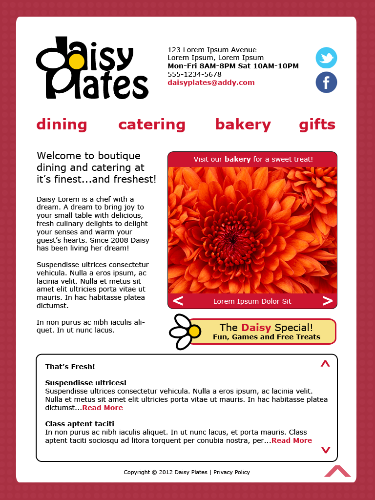
After this initial design, I moved on to create an iPad portrait design of 768 x 1024. In addition to changing the layout of some elements to better suit the narrower width, I fleshed out a few items:

- RSS feeds icon was removed as I was not sure of the great relevance in this site and it looked cleaner without
- contact info was further consolidated using pipes due to space
- main links were moved below the logo due to space
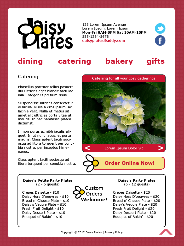
- elaborated on some of the content in the main content area and also determined that the larger text on the homepage could be used as a title for a section, such as “Catering” for catering
- the contest/games section was elaborated on so that it would have more contrast, introducing the warm beige color; it also occurred to me that this design could be used for any special section/link relevant to the current section, such as a link to a page to order online in the catering section
- news reel was moved to the bottom of the screen due to space, which actually allowed for more of it to be seen and a less cluttered main content area; it also occurred to me that this section could be used for additional information for specific sections, like the menu in the catering section
- added a privacy policy link
- added a large floating light raspberry arrow at the bottom of the screen to enable you to return to the top, since on the tablet you will be most likely scrolling far down on a screen at some point either with a scrollbar or by swiping
- determined that clicking the main section links would load a new page for that section
So it was becoming apparent that the second design, created for iPad portrait, was an improvement overall on the original desktop/iPad landscape design. I decided that the iPad portrait version would now become the main design for all, and elements could be removed/adjusted as needed for each, since the idea is to be responsive afterall!
Step 7: build mockups for iPhone and Android phone landscape and portrait
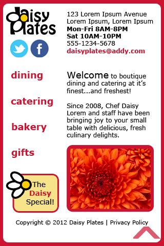
Focusing on iPhone (again, device I had experience with, but not the only phone understandably), I started fresh with a new take on the determined design for desktop/iPad, but in the 320 x 480 (portrait) dimensions of the iPhone. I figured this would be suitable to cover both portrait and landscape (480 x 320), as I was designing for the smaller (i.e. more difficult) size which I anticipate more users will be using. iPhone landscape will of course adjust as needed and have more vertical scrolling/swiping.
Here are the changes I made for iPhone:
- increased the whitespace and decreased the size of the background image
- decreased the size of the logo
- re-arranged the logo, social network icons and contact info to be more appealing in the space
- generally ensured all clickable items were big enough for tapping by finger instead of clicking
- put the main links down the left side with text on the right
- decreased the size of the gallery images and limited it to one image per section
- decreased the size and amount of text on the contest/games section
- removed the news reel altogether
I decided that when it came to the phone version of the site, the user may want to just find important info fast, like hours the store is open, get info on the services still, access contest/games as well as still order, but may not wish to scroll through a bunch of news. However, menus etc. could still show up further down the screen in a more simpler format (not shown in mock-up) as needed, hence the large floating raspberry arrow is still at the bottom to allow the user to go back to the top of the screen easily at any time.
In the end, I have one mock-up for desktop/tablet and one for phone. What’s next? If I refer to my post introducing responsive design, here are my next steps:
- keep your content organized and simple – my designs have planned for this, and I am going to cut out less important info for the phone.
- use dynamic code like the CSS “auto” attribute and similar where you can, and use CSS media queries to switch elements in and out as you need, even if that means whole stylesheets – I plan to do this as I build the responsive site. I can see separate stylesheets for each device, especially with the phone which is quite simplified and has a different layout. Phone design could change depending on how things go. Time will tell!
- pick a set of devices and browsers (and operating systems, players, etc. depending on your target environments) you want to support, whether for a certain client’s requirements or the more common ones for your audience, and test test test as best you can with simulators and in the actual environments – well, although I designed for iPad and iPhone, I actually have access to an actual Android tablet and phone. The Android tablet is a bit smaller than the iPad, and the phone is a bit larger than the iPhone. Either way, combined with testing on Windows 7 desktop in the latest IE, Firefox, Chrome and Sarafi browsers, as well as Safari on a Mac if I can access one, I think this will be a suitable test enviroment for this exercise. No Flash Player or similar players will be required.
I hope you have enjoyed my posts on the responsive site web design process for the fictional boutique catering business “Daisy Plates”!


